Every since I brought home the innocent smoothie carton, I have been itching to do a post about packaging. It brought back some interesting memories from a packaging research I was part of. Trying to check whether consumers understood the key benefit of the product, I remember asking a woman in one of those interviews
What do you think the person who designed this pack is trying to tell you? What was their intention? And the lady replied…
They are trying to tell me never to read this pack. I tried not to laugh knowing I was being watched by clients and asked her with a very serious face….
Sorry I did not follow what you said…And she added…Now you only tell me…who has the time to read all this technical information these days…
She said what most people feel. Packs are boring, cluttered with too much information, almost designed ‘to never be read’. I don’t know yet the fate of that pack we were researching; it is still to be launched. Though I distinctly remember the prototype. The faces of that carton were being treated like prime real estate. Each square inch of that space was filled with symbols, logos, nutritional guidelines, the ingredient list and tiny pictures to symbolize the ingredients, and that was not enough there was the brand charter about 60 words of highbrow talk – and in two languages! And…there was a tiny quiz game - an arcane question, the answer to which had to be found on the pack. Honestly, we did not need to do research to find out the pack was too cluttered but even the slightest suggestion to do away with any of the pack elements would get the marketing team cringing. For them all of it was non-negotiable territory…all of it had to be there!
Isn’t it a twisted logic…first we create clutter and then we spend a lot of time and money trying to figure out…how to break the clutter.
Of the many packs I have seen in the last one year, two elements have stood out in my memory.
- The Sainsbury wheel of health.
o A simple way of depicting the nutritional guidelines. They use colour coding in stead of having to look at numbers
o Moves the information from ‘back of the back’ – associated mostly with boring technical information nobody wants to read – to front of the pack where it catches the attention at the first glance.
o The colour coding uses colours that all of us already have associations with – the colours of the traffic signal – red on the the wheel means, stuff that should be eaten sparingly - since it has far greater amounts of nutrients than what is the recommended daily allowance (RDA). More green on the wheel means that the amounts are in line with the RDA– stuff that is good for you.
- The second being the copy on the innocent smoothies pack
o Simple, easy to read, warm and talking to you in the first person. Makes you want to read.
o Sounds authentic. In synch with their brand values. You believe what you read.
o The font they use on the pack looks friendly and so is their language. You have fun while reading it. Look at what this person found at the bottom of his pack. Mine had an innocuous rhyme :)
If you want a reminder about what not to do with your packaging – watch this youtube video about how Microsoft would design the iPod pack. Contra expectations they seem to have done well with the Zune packs. More about that and some more innocent smoothie talk, tomorrow.
Learning: Consumers are also humans. Talking to us like human beings might help :)
Packaging Research,
Sainsburys,
Sainsburys wheel of health,
innocent smoothies,
 stead of having to look at numbers
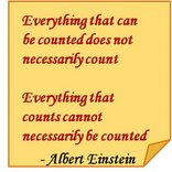
1 comment:
Great reading your blogg post
Post a Comment