Something this evening reminded me of a discussion I was part of - in which my client’s marketing team intensely discussed the packaging of a new brand. Of all the things I heard that day, one thought etched out of the cacophony and remained in my memory since then.
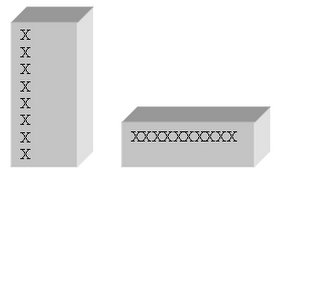
What sparked off the discussion was how the brand name would (or rather should) feature on different product variants which had varying pack sizes. The hour long discussion came to a close when someone, presumably whose word counted a great deal, said that the taller packaging would have to be discarded. There was silence in the room…as much had already been invested in developing the prototype and testing a new shape would mean that they would have to go back to the drawing board – the resultant loss of time could prove lethal for a new brand. However….these words echoed in the silent board room
The manner in which the ‘Brand Name’ is displayed HAS TO remain uniform no matter what. It is our message to our consumer. We cannot be seen sending out such diffused signals.
I never questioned that thought…until today when I sat up suddenly and thought about what Google seems to have done with its branding. We have all become used to seeing cute inclusions every once in a way. What creates more excitement around these doodles is the fact that they do not appear at predictable intervals. So one fine groggy morning when you open your browser you see something different that cheers you up.
I am not sure what the motive was behind creating these holiday logos or whether they was any serious motive at all or whether it was all done in the spirit of being ‘fun’ ‘cool’ ‘refreshing’… ‘anti establishment’…but what I find most fascinating is how they have so simply done away with something that’s was considered so fundamental to branding.
So what sort of signals do changing logos send to the consumer? Well, the way Google has gone about bringing about these changes so seamlessly only goes to show that changing logos do not necessarily translate to different messages as long as the organization is consistent in communicating their over all philosophy or values. At least as a consumer, I did not notice a perceptible difference in the last 6 – 7 years or maybe I was just slow in my reaction to this issue. The message I get when I think about it consciously is that – here is an organization that challenges pre-defined ways of doing things and also more importantly an organization that is not ‘in-ward’ looking.
It’s a greater marketing sin in my mind, to keep these basic elements intact but have a portfolio of brands / products that are taking off in different directions.
Will the ‘logo’ by and large still be considered immutable or will we see more organizations experimenting with their branding elements in the days to come? It would be interesting to watch.
You can see their archive of holiday logos here. The site even has some even created by Google Fans though I never liked any of the latter.
Google Logo,
Brand Logo,
Branding and Logo


